Make Your Restaurant Website Design Stand Out. Tips by a Restaurant Website Designer
Let’s face it, most dining experiences now start on your mobile phone and the socials. We are all guilty of lost hours spent finding that restaurant you MUST eat at when in a new city, or just finding the right food for right now.
The social media pics are great but what about finding the menu, location, and opening hours quickly. Why? our attention spans are shortening and it is pretty frustrating when you turn up and the restaurant doesn’t open until 7 pm.
As a restaurant web designer and a lover of good food, I think strategy and design is now an overlooked area, because of the perceived ease of social media to advertise restaurants and offerings.
But with weird algorithms, and posts getting lost in a sea of others, you shouldn’t sleep on the potential of your website. There is strategy and professionalism involved, which means you may be missing out on customers.
So what do I mean by all this? Let’s have a look below at the tips a restaurant website designer can offer:
You Eat With Your Eyes…Just like at your Restaurant
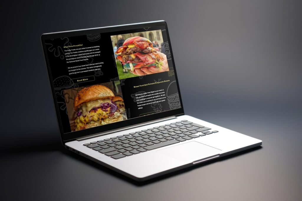
There is no doubt that when you first land on a restaurant website you are looking for those delicious pictures of the food on offer.
Your pictures should be high-quality and professional, highlighting your signature dishes, the unique experience your customers would get and really showcasing your restaurant vibe. If you are a fine dining restaurant, then go for classy, arty, minimalistic pics. If more casual, then your photos should reflect that, maybe some fun and candid pictures.
This is done expertly on the socials but on a website, you have better control over what you want customers to see, when you need to see them and more importantly, what you want them to do on your website, i.e. book that table, buy that limited edition hot sauce. A website can strategically guide its visitors to do what they need.
Also, food photographers exist because they know what they are doing and how to display your food in the best light possible to get your potential customers salivating. Using a professional photographer is a great consideration. As a web designer for restaurants, I can always recommend some great photographers if you need some help.

An Easy User Experience
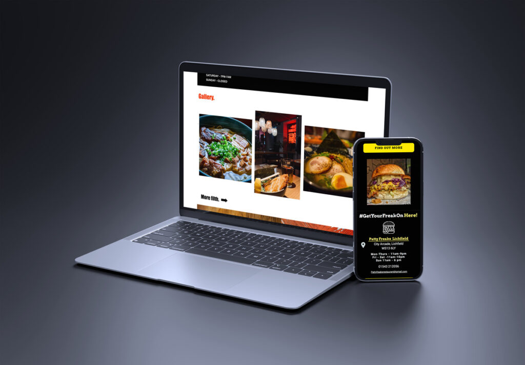
The online space is now ‘mobile first’, meaning you should prioritise mobile responsiveness to help your ranking in search engines. People have short attention spans, so you need effortless navigation, quick loading times and easy site navigation so customers don’t get bored or frustrated and look elsewhere.
It should be super easy for the customer to find what they want. With the correct strategic restaurant website design this can easily be achieved.
A great experience when landing on your restaurant website not only helps potential customers relax but also enhances their perception of your restaurant’s professionalism and care. In the end, a user-friendly website makes it easier for diners to choose you and return.
Story Tell Through Design

Socials are great for conveying all the good food you make. But do they really ell your story? Through the design of your restaurant website, search engine optimisation and strategic planning your customer journey, you can blend design elements that reflect your restaurant’s ambience, culture and culinary philosophy. Make it resonate with your customers and get them excited about visiting your restaurant.
Booking Ease and Efficiency
Let’s be frank about this. It is real annoying when all you want to do is book a table. You send a DM on Instagram or Facebook and you get a generic response, that just sits there for days. This should be the easy part. Your customers should find out how to book a table easily. The.End. Using the correct website hierarchy means every question your customer has should be easily answered. Finding the book a table page, restaurant menus and even how to contact you for big table bookings. Don’t rely on a load of DM’s which get lost in a sea of comments.
Social Proof and Testimonials
You should be shouting from the rooftops when you receive a great review. Use these customer testimonials and reviews for ‘social proof’, ie people can see that others love your restaurant and prove to them yours should be a place on their must-visit list. Put them on your website.
It’s always great for Google to see. If you keep collecting positive reviews then Google will also think it’s a great place and so it helps book you up the search results page. More visibility means more eyeballs on your website and more customers and cash money, cha-ching!

Showcasing Events and Specials
Your website should be alive. Keep displaying upcoming events, specials, or promotions. Engage your visitors with enticing offers, themed nights, or chef specials that encourage repeat visits and add excitement.
All this will encourage visitors to keep checking back on your website and become repeat customers. It also helps Google know your business is alive and kicking and can bump you up the search rankings too.
As well as designing websites for restaurants I also have great knowledge about optimising your website for search engines and your customers. This should always go hand in hand with the best website design.
Reflect Brand Personality
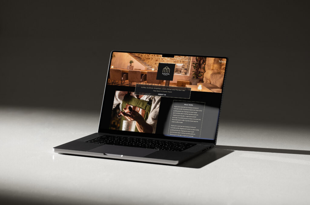
You should always stay true to your brand’s personality. Whether you are a fine dining restaurant or a casual place, the website should reflect the ambience and character of your restaurant. Whether fun or fancy! Your website can be the place to get this across.
I had the absolute pleasure of dining at Ynyshir Restaurant. It is now a two-Michelin-starred restaurant. One would think, judging by the standard of their food pics on Instagram that you should be wearing your best suit or ballgown to eat here but nope. Ynyshir is about fun dining and not fining. You can wear whatever you feel comfortable in. Their website conveys this through an Uber cool design and FAQ section where the dress code (or lack of) is easily found.
Final Thoughts by a Restaurant Web Designer.
A standout restaurant website isn’t just about displaying menus and location, although these are crucial; it’s an immersive experience that tantalises taste buds and draws people in.
You need to blend visuals, intuitive design, engaging elements, and a dash of storytelling, and your restaurant web design can become a destination in itself!
Incorporating these vital ingredients, strategy, and local SEO is crucial for a website that serves up actual results and shows up high in the Google search results page. My packages bundle these essentials, and I sprinkle my love for food and drink into every design I do. If you are interested in a free chat or custom proposal then you can get in touch with me. I would love to chat.
I believe the finest food deserves the finest websites
Drop me a comment